Packaging Redesign
Qsquare
-
Visual Communication / Brand Identity Extension / Packaging Design / Graphic Systems & Pattern Development

Brand Style
& Redesign
Brand Style
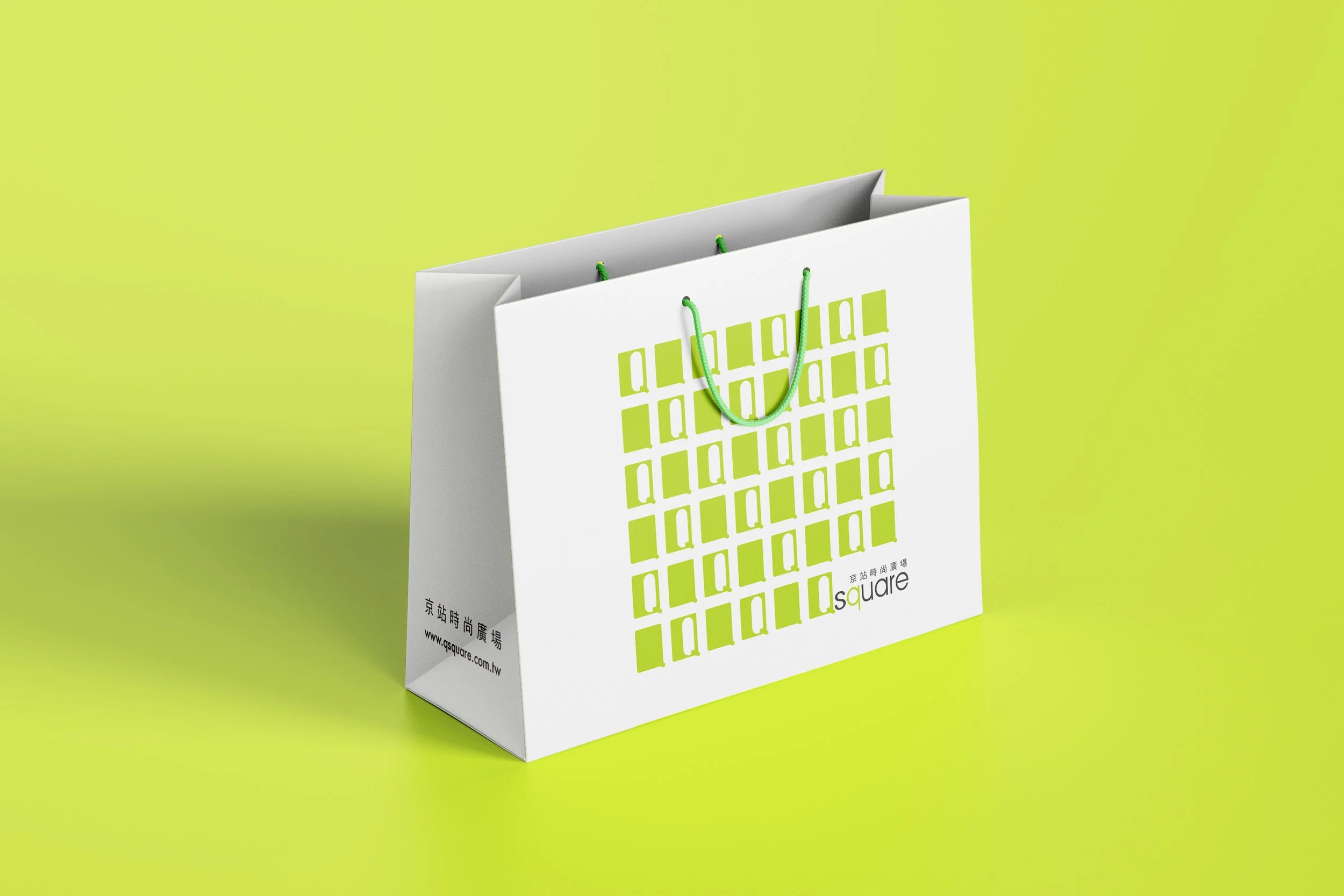
Qsquare’s visual identity emphasizes modernity and simplicity. The original packaging relied on a bold, oversized "Q" logo to create strong contrast and immediate recognition, reflecting the department store’s contemporary and urban positioning.
My Redesign
Building on that foundation, I reinterpreted the "Q" motif with a digital aesthetic, transforming it into a grid of repeated elements that reference coding patterns. This approach preserved the brand’s minimalist DNA while introducing a sense of rhythm, modernity, and innovation—qualities that resonate with Qsquare’s forward-looking image.