LONG
Loved for Life
PET FOOD BRANDING
-
Visual Communication / Brand Strategy / Logo Design / Typography

CORE BRAND ELEMENTS
Visual Identity
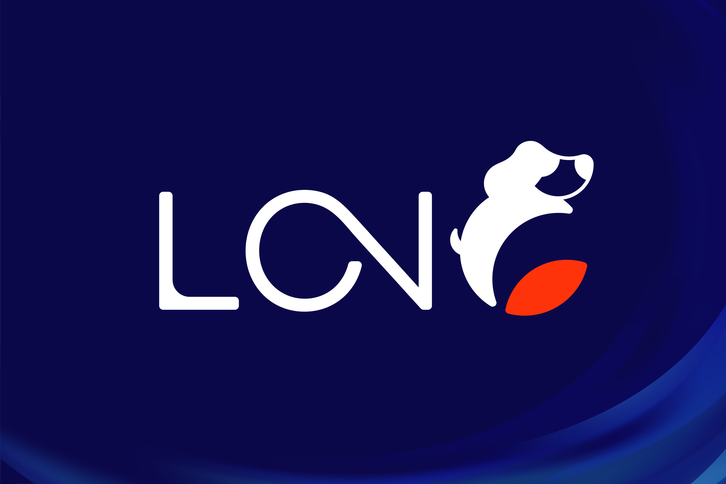
I designed the logo for a newly established pet food brand. The client’s only input was their Mandarin name, 瀧寵, which means “pets are fully loved.” To create an international identity, I developed the English name LONG, preserving the Mandarin pronunciation while adding layered meaning — a brand that pets long for, and one that supports their long, healthy lives alongside their families.
Color Palette
The visual identity reflects this balance of elegance and warmth. Navy blue conveys a refined, trustworthy brand image, while warm orange brings in sincerity and affection, symbolizing the deep bond between pets and their humans.

# FE330A
# 0B084A
254 / 51 / 10
RGB0 / 80 / 95 / 0
CMYK11 / 8 / 74
RGB100 / 96 / 42 / 1
CMYK

