
Google UX Design Certificate:
ART MUSEUM APP
UX Research & Strategy / Interaction Design / UI & Visual Design High-Fidelity Prototyping / Inclusive Design
An evidence-based mobile app bridging language gaps and eliminating logistical friction at Taipei's premier cultural institutions.
An evidence-based mobile app bridging language gaps and eliminating logistical friction at Taipei's premier cultural institutions.
Role Lead UX Researcher & Product Designer
Duration January 2026 – Present
Context Google UX Design Certificate
The Product An evidence-based mobile application that bridges systemic language gaps and eliminates logistical friction at Taipei's public fine arts institutions.
OVERVIEW
Taipei’s world-class museums attract diverse global visitors, yet their digital tools fall short—leaving foreign tourists isolated by language barriers and educators overwhelmed by complex group logistics.
The Goal
A responsive mobile app offering time-based, multilingual guidance for independent travelers, alongside streamlined booking and routing for educators.
The Problem
Foreign Tourists
Lack flexible, multilingual tools to explore independently.
Local Educators
Face booking friction and unclear facility info when planning field trips.
User Research & Pain PointsVisitor data at TFAM and NPM disproved our initial assumption that the app should target local casual visitors checking exhibition hours.
Instead, two distinct high-need user groups emerged:
International tourists are locked into rigid guided tours.
→On-demand, self-paced audio guides.
Language Barriers
Massive museum footprints overwhelm short visits.
→Time-based itineraries
Choice Paralysis
Unclear facility data causes field-trip anxiety.
→Micro-spatial mapping & facility data.
Logistical Uncertainty
Slow manual calls/emails delay group visits.
→Real-time digital booking
Booking Friction
Target PersonasKenji
Sarah


The Time-Constrained Tourist
A busy professional visiting Taipei on a short schedule.
Goal
Explore cultural exhibits independently at his own pace.
Need
On-demand audio commentary and dynamic, time-based itineraries without joining rigid tours.
The Overwhelmed Educator
A middle school art teacher organizing field trips for 30+ students.
Goal
Ensure smooth logistics and student safety on-site.
Need
Streamlined group booking and detailed spatial mapping (elevator capacities, exit routes) to avoid unexpected barriers.
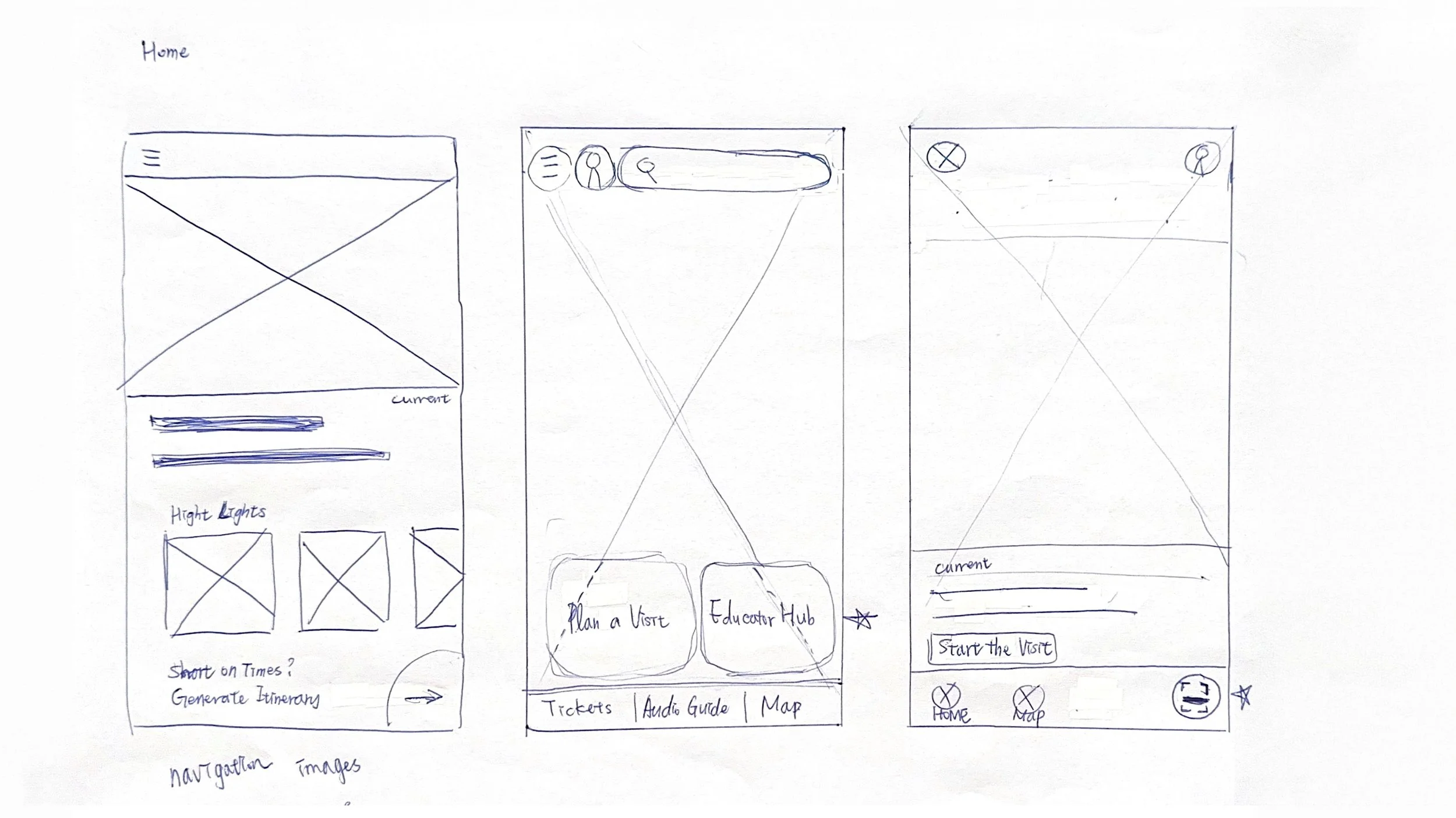
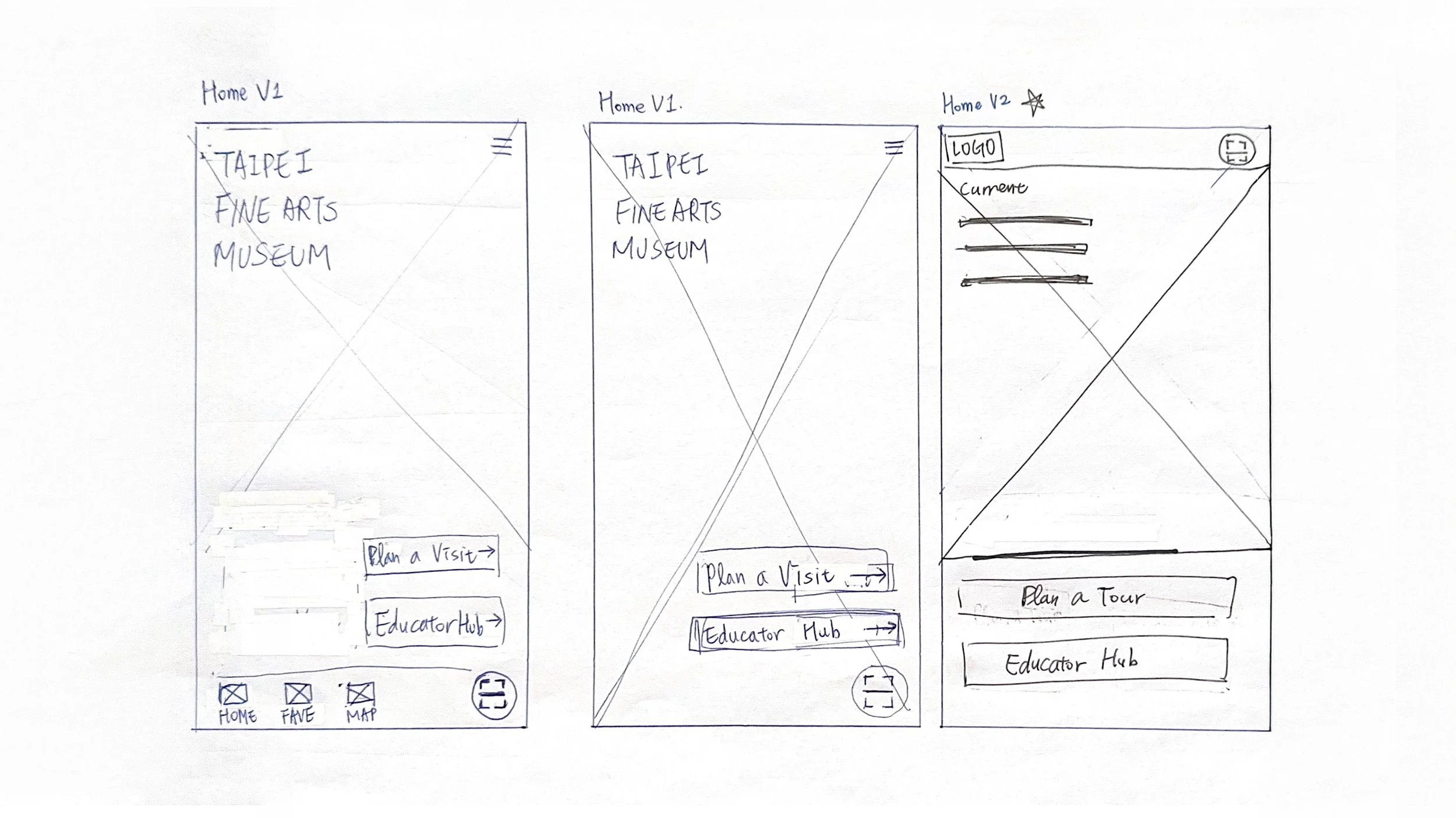
Ideation & Tactical WireframingPaper to Digital Transition
“I focused on bypassing complex menus to get tourists and educators straight to what they need.”
Immediate Segmentation
Onboarding splits immediately into Tourist or Educator flows to reduce menu fatigue.
Thumb-Zone Scanning
A floating quick-action button bypasses search to trigger artwork audio in one tap.
Lower Cognitive Load
Replaced manual typing with smooth sliders and choice chips for easy on-the-go interaction.
Paper Wireframe
Digital Wireframe
Usability Evaluation & Refinement
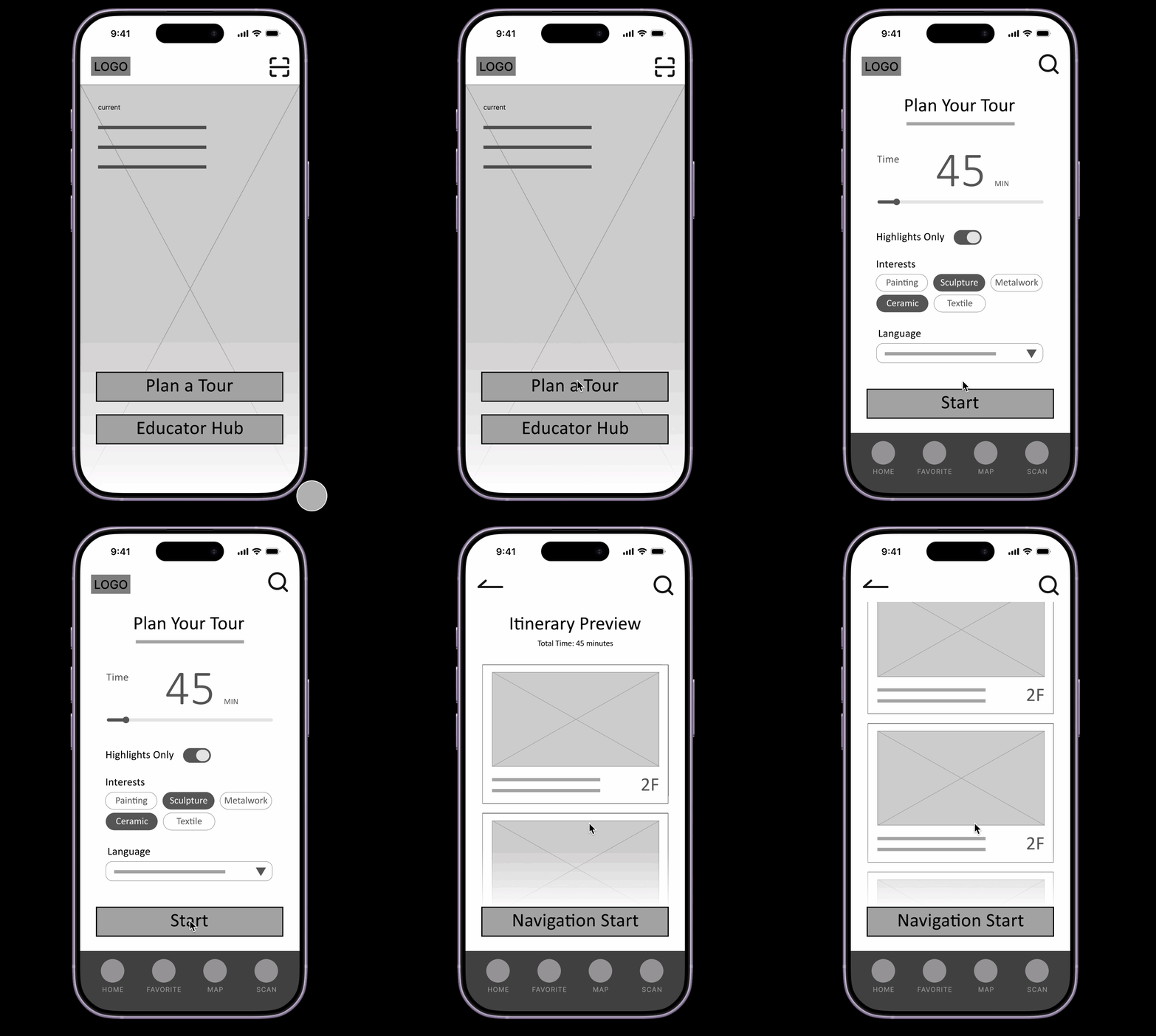
Two rounds of usability testing helped remove guesswork and refine core interactions:
Clear Exit Controls
Users habitually tapped the top-left logo to exit active maps. Added an explicit, text-based "Exit" control to prevent navigation loops.
Ergonomic Scaling
Expanded language selectors and filter chips to standard touch guidelines for effortless use while walking.
Explicit Icon Labels
Added text labels alongside primary icons to eliminate ambiguous navigation.
High-Fidelity UI &
Visual System
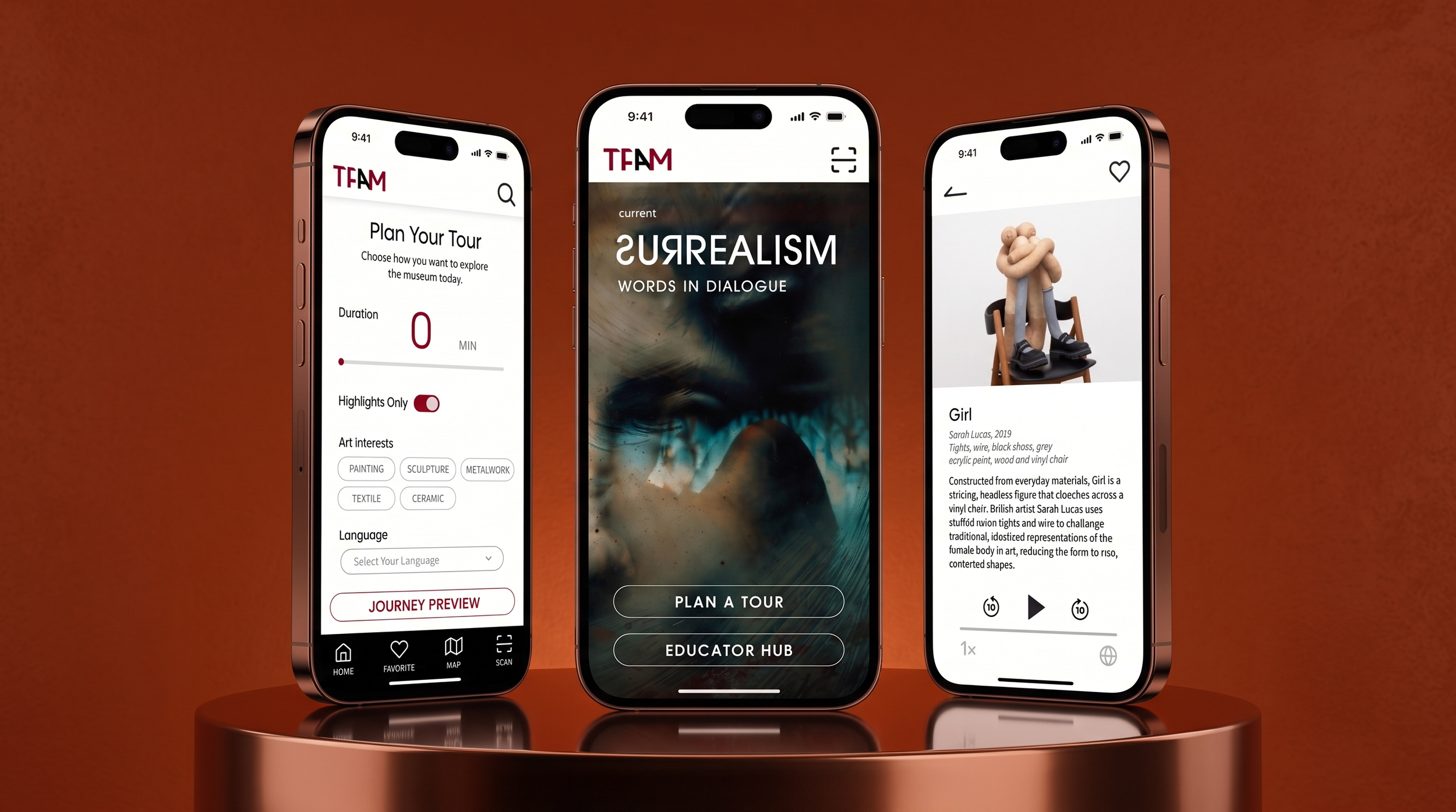
Translating lo-fi wireframes into the final UI required balancing fine-arts elegance with strict functional clarity.
Palette with Purpose
Deep terracotta, obsidian, and high-contrast ivory mirror a premium museum aesthetic while ensuring readability in dim gallery lighting.
Aesthetic Meets Usability
Rich visual hierarchy guides the eye, making navigation effortless without distracting from the artwork.

Key Visual & Interactive Elements
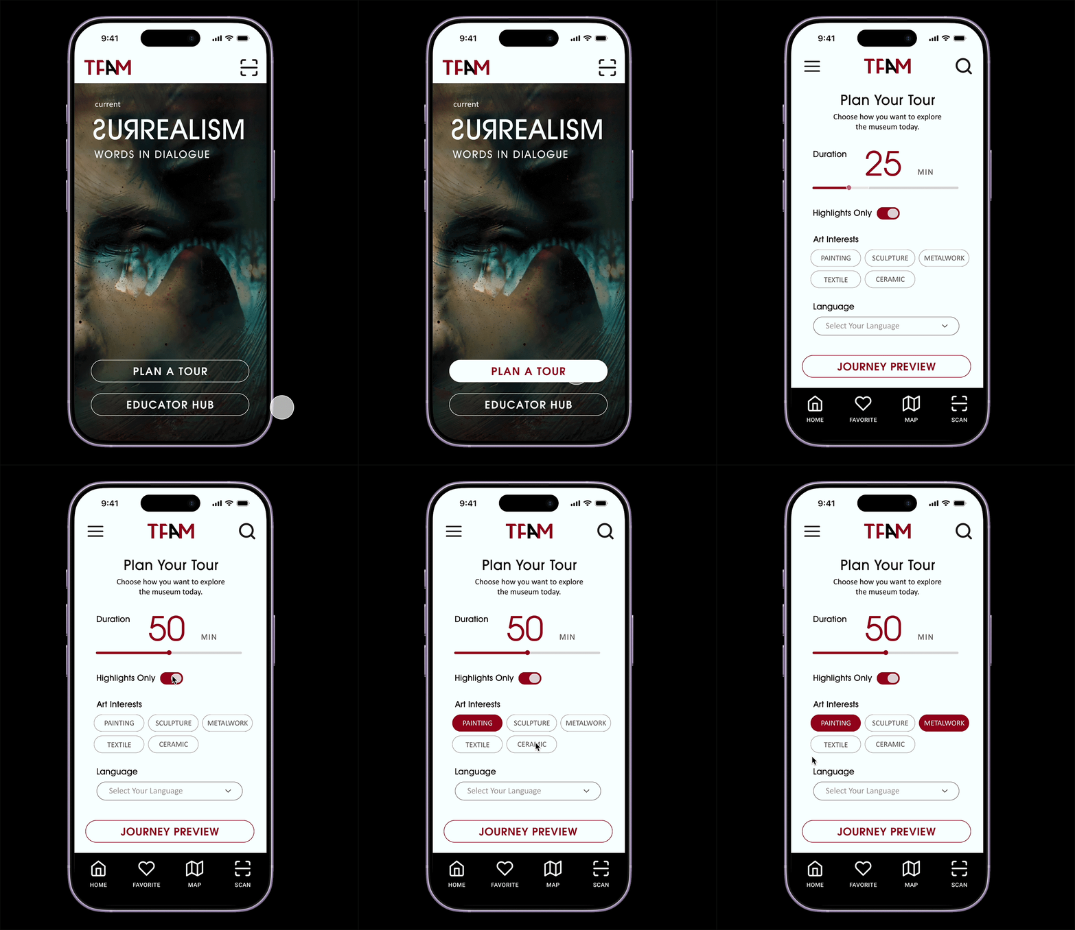
Full-Bleed Exhibition Cards
Large typography and high-res imagery immerse users immediately without cluttering the screen with dense text.
Interactive Tour Filters
Replaced drop-down forms with horizontal choice chips and a duration slider, letting users build itineraries in under 10 seconds.
Persistent Audio Player UI
Features synchronized transcripts, 10-second skip controls, and single-tap language switching for seamless on-the-go listening.
Universal Design & Accessibility
Accessibility was embedded into the core visual architecture rather than added as an afterthought, built on three inclusive pillars:
Language Autonomy
Persistent language toggling and live audio transcripts allow international visitors to navigate content without friction.
Humanized Touch Targets
Sized interactive controls—like sliders and filter chips—to ergonomic touch standards to prevent accidental taps on the move.
Semantic Labeling
Paired navigation icons with text labels (Home, Favorites, Map, Scan) to reduce cognitive load.
Impact, Reflections & Next Steps
-
The final high-fidelity prototype bridges critical cultural gaps for international museum visitors in Taipei. By combining flexible itinerary planning with decentralized, multilingual audio commentary, the application lowers the barrier to entry for fine arts engagement and gives independent travelers complete autonomy over their cultural experience.
-
Visuals are Functional Logic. This project reinforced that UI choices—such as color contrast, typography scale, and component positioning—are not merely decorative. They serve as direct functional mechanisms that accelerate human data processing in physical environments.
-
Moving forward, I will begin wireframing the comprehensive user flows for Phase 2: building out the Educator Hub framework.